
1. Beach Shower with Sprite Dispenser
![]()
This is an absolutely imaginative advertising move. Who would want to bath at the boring old beach shower when you can bathe under the glory of the giant Sprite dispenser? The thing itself is massive and is easily noticeable, now that is a big advertising place. It’s up to us to shower with it or not? That is just genius. Whoever this marketing manager is, someone should award them with a medal. Now, if only it was actually Sprite that they were bathing with, that would be pretty cool. Drink as you bathe. Quench your thirst. Oh wait, but then you would get all sticky and icky. Now that would just beat the initial intention.
2. McDonald’s Giant French Fries Zebra Crossing
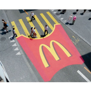
This is easily visually charming if looked at from the top. I wonder how it looks like on a pedestrian level view. But with that aside, this is innovative and pretty eye catching, genius to say the least. Who on earth could imagine that you could turn a Zebra crossing to a pack of McDonald’s French fries? The company is one of the world’s biggest and successful fast food restaurants out there, and they would stop at nothing to produce innovative and charming advertising campaigns. This is certainly one of them.
3. Nike’s Run, Don’t Sit Bench
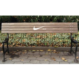
People love humor, and this hilarious “Don’t sit, Run” move by Nike is definitely a win. They created benches that are not actually benches, with the logo Nike Run printed on them and placed at parks that were usually used as running trails. This pretty much would encourage runners to continue what they are doing, and at the same time promote activity and create brand awareness. But it is Nike, after all. Who on earth does not know Nike? A great advertising move indeed, if your legs are tired, and you see this bench, you just cannot help it but to continue
running.
4. Men of Steel Elevator Ad
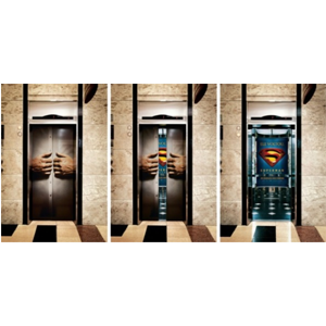
Now everybody knows that whenever the ideal Men of Steel, Clark Kent wants to change to Superman, he would
pull his shirt apart to reveal the logo on the chest of his suit. Anybody who follows pop culture would know this,
and associate the act of pulling your shirt apart has to do with superman. The film Men of Steel did an impressive
advertising move by pasting on stickers on elevator doors that favor a hand grabbing on to the shirt, and as the
elevator doors open, Very out of the box indeed, it would reveal the logo inside of it.
5. Show don’t tell.

David Otokpa of Brazil created this simple but successful move for FedEx, using continental maps on buildings to get their message, and their package, across.
6. Get creative with the details.
The online download bar made from music fans and musicians is used in the “Switch off illegal downloads, Switch on MTV” move to show that fans actually harm their musical heroes when they steal their music. Getting creative with the details can liven up an image that in itself isn’t that interesting. Patrick Ackmann was the
Creative Director on this cool project for MTV Europe.
7. Show your customers that you get them.
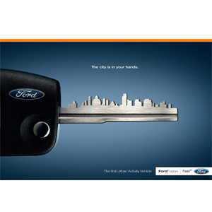
Think about your aimed audience – where do they live? What do they do? The key skyline in Ogilvy’s ad for the Ford Fusion positioned the automobile as one for city-residence explorers.
8. Play with scale.

The aim of this project by California State University – Long Beach was to show the use and convenience of owning a Mini Cooper. They overdramatized the story of being small and fitting into any environment to create a magical world where the cars co-existed with ladybugs.
9. Alter photographs to create meaning with the details.
Executive Creative Director Julian Watt and his Australia
10. Grab their eye with recognizable icons.
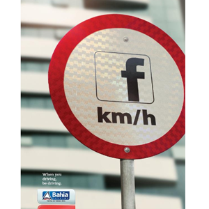
Brazilian Ad. Agency Leiaute worked with Government of Bahia to reduce the number of accidents and deaths related to smartphone use. Each ad uses a social media network symbol in place of important driving signs.
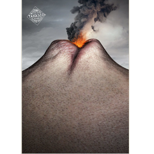
11. Rely on a single strong visual to communicate the key concept.
Nicolas Baillargeon was tasked to create images that communicate the key importance of hot and spicy Tabasco sauce – the spicy heat itself. This bold image of a volcano crafted from a human face does the trick for me.
12. Recruit a superhero.
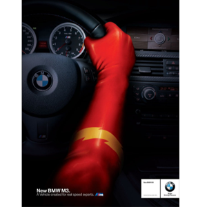
Creative Director Marco developed this concept for BMW hinting that DC Comics superhero knows a thing or two about speed which kept the watchers of the move tongue-in-cheek.
13. Meet your clients where they work.

When Vodafone hired Y&R, İstanbul/Team Red, Turkey to publicize the specialized services that they’re providing for farmers, they used their imagery to speak to place.
14. Use optical illusions.
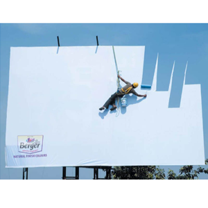
This billboard advertisement by JWT Mumbai for Berger seemingly blends the company’s paint into the
sky…provided it’s a clear sunny day.
15.Think about the “where.”
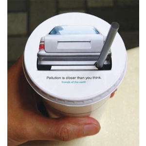
JWT Hong Kong created this air pollution awareness campaign on the top of drink lids used by roadside food carts to get customers thinking while they’re immersed in the problem.
16. Create a humorous riff on a classic ad.
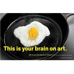
I’m old enough to remember the “fried egg” 80s PSAs showing what happens to our brains when we consume drugs. This ad move for the College for Creative Studies mocks the originals in a clever, humorous way using a great combination of copy and visuals. The Edvard Munch egg yolk adds a funny, thematically relatable visual element.
17. Show a typical use for the product in a creative way.
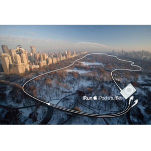
iRun by Steve Quint showed the Apple iPod Shuffle in a different way by using the earbuds to depict a running path through Central Park.
18. Play with white space.
This engaging move for Tide takes being a solution to stain removal to a whole new level.
19.Take away the pain.
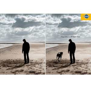
Although I think that this Pedigree dog adoption ad could have been better (e.g., offer another pose of the downtrodden lonely man to make him more exuberant), the concept is nice way to show how adopting a dog actively changes a person’s emotional state and a good way to make an emotional connection with the target audience.
Comments